

Why Your SaaS Website Isn’t Converting Visitors Into Customers
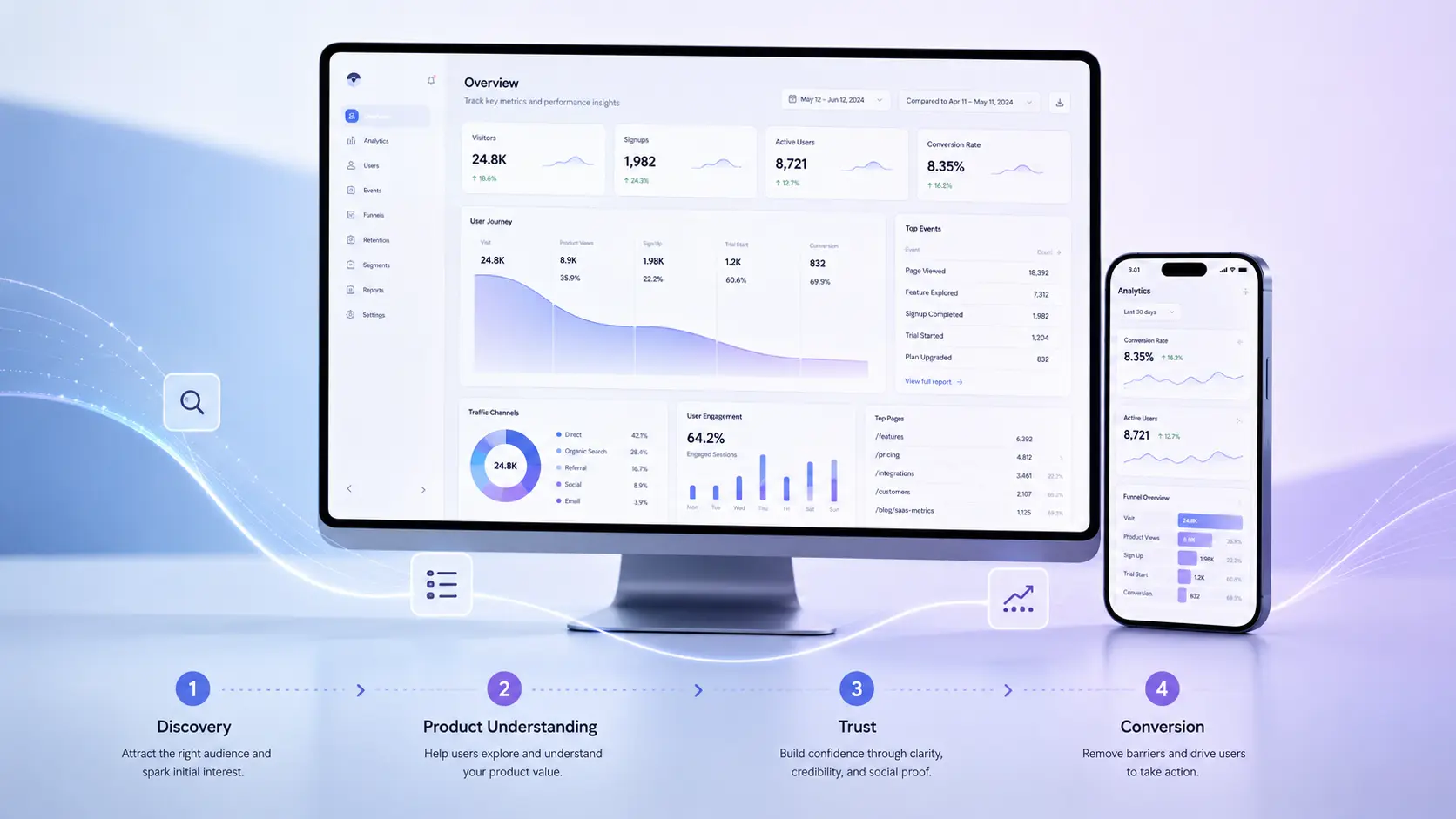
The most common SaaS website conversion problems, and how to fix them.
Your SaaS website may be attracting traffic, ranking for relevant keywords, and presenting a polished visual identity. Yet qualified visitors still leave without requesting a demo, starting a trial, contacting sales, or taking the next meaningful step.
This is where SaaS website conversion optimization becomes critical. It examines the entire experience to identify what prevents qualified visitors from understanding the product, trusting the company, and taking converting into a customer.
The natural reaction is to assume the website needs a stronger call to action, a shorter form, a more modern design, or a rewritten headline.
Sometimes it does.
More often, low conversion is the visible symptom of a deeper strategic problem.
The website may not clearly explain the product. It may organize information around internal business divisions rather than buyer priorities. The website may present features without connecting them to meaningful outcomes. It may ask for commitment before establishing trust. The platform may direct every visitor toward the same conversion path, regardless of their role, awareness, company size, or buying stage.
In other words, the problem is rarely one button.
A SaaS website converts when the entire experience helps the right buyer understand the product, recognize its relevance, trust the company, reduce perceived risk, and confidently move forward.
That requires more than attractive SaaS website design. It requires alignment between business strategy, product marketing, information architecture, user experience, content, technology, search visibility, and conversion strategy.
This guide examines the most common reasons SaaS websites fail to convert and what growing SaaS companies can do about them.
What Is SaaS Website Conversion Optimization?
SaaS website conversion optimization is the strategic process of improving a website so that more qualified visitors complete meaningful actions, such as requesting a demo, starting a free trial, creating an account, contacting sales, or exploring product information.
It combines qualitative research, behavioral data, UX strategy, product messaging, content design, technical performance, experimentation, and measurement.
The word qualified matters.
A higher conversion rate is not automatically a better business outcome. A website could increase form submissions by attracting poor-fit prospects, hiding pricing conditions, or making a low-commitment action look more valuable than it is.
The objective is not to persuade every visitor to convert.
The objective is to help the right visitors make informed decisions with less confusion, less friction, and greater confidence.
Why Do SaaS Websites Fail to Convert?
Most underperforming SaaS websites have one or more of the following problems:
- The product is difficult to understand.
- The messaging focuses on features rather than buyer outcomes.
- The information architecture reflects the company instead of the customer.
- The website treats every visitor as though they have the same needs.
- The experience asks for commitment before building trust.
- The call to action does not match the buyer’s level of intent.
- The website separates marketing claims from product evidence.
- Mobile usability and technical performance create friction.
- SEO brings traffic that does not match the offer.
- The company measures activity without measuring buying progression.
Effective SaaS website conversion optimization addresses these issues as an interconnected system rather than treating each one as an isolated defect. A SaaS company cannot solve weak positioning with visual design alone, and it cannot solve a confusing user journey by changing button colors.
Conversion is an experience-level outcome.
1. Your SaaS Product Is Harder to Understand Than You Think
One of the greatest conversion barriers in SaaS is not a lack of interest. It is a lack of clarity.
Product teams live inside their platforms. They understand the terminology, workflows, integrations, user roles, competitive distinctions, and technical architecture. That familiarity creates an unavoidable knowledge gap between the company and the prospective buyer.
What feels obvious internally may be incomprehensible to someone encountering the product for the first time.
A visitor should not have to decode:
- What the product actually does
- Who it is designed for
- What problem it solves
- How it fits into an existing workflow
- Why it is different from competing options
- What business outcome it can improve
- What the visitor should do next
When those answers are not immediately clear, visitors rarely work harder to understand them. They leave.
The Five-Second Clarity Test
A qualified visitor should be able to look at the top of a SaaS homepage and quickly answer three questions:
- What is this?
- Is it relevant to me?
- Why should I continue?
This does not mean every detail must appear in the hero section. It means the opening message must establish enough relevance to earn the visitor’s attention.
A headline such as “Unlock the Future of Intelligent Collaboration” may sound ambitious, but it provides little practical information.
A stronger message connects the product to an audience, problem, or outcome:
Coordinate complex field operations from one unified platform.
The second statement gives the visitor something concrete to evaluate. It may not explain the entire platform, but it creates orientation.
Clarity Is Not the Same as Simplicity
SaaS companies sometimes oversimplify their messaging in an effort to make it accessible. They remove important distinctions, avoid technical details, and reduce a sophisticated platform to a generic promise.
That can be just as damaging as excessive complexity.
Enterprise buyers do not need the product to sound simple. They need the product to be explained clearly.
A strong SaaS website should support progressive understanding:
- Begin with the central value proposition.
- Explain the core problem and business outcome.
- Introduce the product’s operating model.
- Show the most relevant capabilities.
- Provide deeper evidence for visitors who need it.
- Offer technical detail without forcing every visitor to encounter it immediately.
The goal is not to remove complexity. It is to structure complexity.
2. Your Messaging Describes the Product but Does Not Sell the Change
Many B2B SaaS websites are built around a product inventory:
- Features
- Integrations
- Dashboards
- Automations
- Analytics
- Permissions
- Workflows
- Reporting
These details matter, but buyers are not purchasing a list of capabilities. They are evaluating whether the product can improve their current situation.
Effective SaaS product marketing connects three layers:
| Layer | Question It Answers | Example |
|---|---|---|
| Capability | What does the product do? | Automates invoice reconciliation |
| Operational value | What becomes easier or faster? | Reduces manual finance workflows |
| Business outcome | Why does that matter? | Helps the finance team close books faster and improve reporting accuracy |
Weak messaging stops at the first layer.
Strong messaging connects all three.
The Buyer Is Evaluating Change, Not Just Software
A SaaS purchase often requires more than approving a subscription.
It may require:
- Migrating data
- Replacing an existing platform
- Retraining employees
- Integrating with core systems
- Gaining executive approval
- Securing budget
- Managing implementation risk
- Changing established processes
The website must therefore communicate more than value. It must make change feel manageable.
This is particularly important for enterprise SaaS websites. The buyer may believe the product is capable and still decide that adoption feels too disruptive.
Strong product storytelling should explain:
- What improves after implementation
- How the product fits into existing operations
- What the transition involves
- How quickly value can be achieved
- What support is available
- How security and compliance are handled
- How the platform scales with the organization
A Useful Messaging Framework
For each major product page, answer the following:
Problem: What is happening in the customer’s world?
Consequence: What does that problem cost in time, revenue, risk, accuracy, or growth?
Change: What better state becomes possible?
Mechanism: How does the product create that change?
Proof: Why should the buyer believe the claim?
Action: What should the visitor do next?
This framework prevents content from becoming either too vague or too feature-heavy.
3. Your Information Architecture Mirrors Your Company, Not Your Buyers
Information architecture determines how content is categorized, labeled, prioritized, and connected across the website.
It is one of the most important parts of SaaS UX, yet it is frequently treated as a navigation exercise near the beginning of a redesign.
A navigation menu is only the visible surface of information architecture.
The deeper question is whether the website reflects the mental models and decision-making needs of prospective buyers.
Internal Structures Create External Confusion
SaaS companies often organize websites around:
- Internal product teams
- Business units
- Legacy product names
- Acquired companies
- Technical modules
- Departmental ownership
- The company’s sales structure
Those categories may make sense internally. They may mean very little to a buyer.
A visitor is more likely to think in terms of:
- Their industry
- Their role
- Their problem
- Their use case
- Their company size
- Their existing technology
- Their desired outcome
A strong SaaS information architecture creates clear entry points without duplicating the entire website for every audience.
Information Architecture Should Support Multiple Buying Paths
Consider three visitors arriving at the same SaaS platform:
- A chief financial officer wants to understand financial impact and risk.
- An operations leader wants to evaluate workflows and implementation.
- An IT leader wants to assess architecture, integrations, security, and governance.
They are evaluating the same product through different criteria.
A single generic product page may not answer any of them well.
An effective architecture might connect:
- Product overview pages
- Capability pages
- Solution or use-case pages
- Role-specific pages
- Industry pages
- Integration pages
- Security and compliance resources
- Customer stories
- Technical documentation
- Pricing or packaging information
The important point is not to create more pages. It is to create better pathways.
Common SaaS Information Architecture Warning Signs
Your website may need structural work when:
- Users rely heavily on site search to find basic information.
- Product pages repeat the same generic messaging.
- Navigation labels require insider knowledge.
- Multiple pages compete for the same search intent.
- Important trust content is buried in the footer.
- Every page drives visitors directly to a sales form.
- Product, solution, and industry content are nearly identical.
- The website has grown through additions without periodic restructuring.
- Marketing cannot explain where new content belongs.
- Search engines struggle to determine which page is authoritative for a topic.
A website redesign should not preserve an ineffective structure simply because teams are familiar with it.
4. Your Website Treats Every Visitor the Same
A founder evaluating software for a 15-person startup does not buy like a procurement team evaluating an enterprise platform.
A product-aware visitor does not need the same introduction as someone who has only begun researching the problem.
A technical evaluator does not prioritize the same information as a marketing executive.
Yet many B2B SaaS websites present every visitor with the same message and the same call to action.
SaaS Buyers Arrive at Different Levels of Awareness
A visitor may be:
- Problem aware: They recognize a business issue but do not know the available solutions.
- Solution aware: They understand the type of platform they may need.
- Product aware: They are familiar with your company and comparing options.
- Decision ready: They need validation, pricing, security, implementation details, or stakeholder approval.
The website should help visitors advance from their current level rather than forcing everyone into the same funnel.
Example Content by Awareness Level
| Buyer Stage | Primary Need | Useful Content |
| Problem aware | Understand the issue | Guides, benchmarks, educational articles |
| Solution aware | Compare approaches | Solution pages, use cases, methodology |
| Product aware | Evaluate fit | Product tours, integrations, customer stories |
| Decision ready | Reduce risk | Pricing, security, implementation, demo |
This does not require invasive personalization or complicated technology.
It begins with content strategy, page hierarchy, internal linking, and meaningful choices.
Stop Designing Every Page Around “Book a Demo”
A demo can be the right primary conversion for a sales-led SaaS company. It should not be the only useful action available.
Some visitors need to:
- Watch a product tour
- Explore a use case
- Review integrations
- Read a customer story
- Compare plans
- Understand implementation
- Examine security practices
- Estimate return on investment
- Share information with another stakeholder
These are not distractions from conversion.
They are part of conversion.
A visitor who studies security documentation and later requests a demo may be more valuable than someone who submits a form after reading one headline.
The website should support the entire decision process, not only the final handoff to sales.
5. You Are Asking for Trust Before You Have Earned It
SaaS buyers are not only evaluating product value. They are evaluating risk.
They want to know whether the platform is reliable, secure, credible, supported, scalable, and likely to remain viable.
A polished visual identity can contribute to confidence, but good design alone is not proof.
Trust Must Be Designed Into the Experience
Trust comes from the cumulative effect of many signals:
- Specific, credible messaging
- Recognizable customer logos
- Detailed customer stories
- Quantified outcomes
- Product screenshots
- Honest implementation information
- Security and compliance content
- Leadership visibility
- Clear pricing or packaging guidance
- Professional content quality
- Consistent interaction patterns
- Reliable performance
- Accessible interfaces
- Clear privacy practices
- Evidence of ongoing product development
The strongest trust signals are relevant to the claim being made.
A row of logos may establish market presence. It does not prove that the product reduced reporting time by 40 percent.
A testimonial may communicate satisfaction. It may not answer technical concerns.
A security badge may create reassurance. It should link to substantive information.
Replace Generic Social Proof With Decision Support
Compare these two statements:
“This platform transformed our business.”
And:
“The platform reduced weekly reconciliation work from two days to three hours across our finance team.”
The second statement is more persuasive because it gives the buyer a concrete outcome and operating context.
A useful customer story should explain:
- The customer’s situation
- The challenge
- Why previous approaches were insufficient
- Why the product was selected
- How implementation worked
- What changed
- What measurable results followed
- Who benefited
Customer evidence should appear near the claims it supports, not only on a separate case studies page.
6. Your Calls to Action Do Not Match Buyer Intent
Calls to action often receive disproportionate attention during SaaS website conversion optimization, even though button wording is only one part of the broader conversion experience.
Teams debate whether to use:
- Book a Demo
- Get Started
- Start Free
- Talk to Sales
- Learn More
- See It in Action
Wording matters, but relevance matters more.
A call to action fails when it asks for a larger commitment than the visitor is ready to make or does not explain what will happen next.
Build a Conversion Architecture, Not a Collection of Buttons
A conversion architecture defines:
- The primary action for each audience
- The secondary action for lower-intent visitors
- The relationship between content and conversion
- What information must appear before an action
- How forms are structured
- What happens after submission
- How marketing and sales systems receive the lead
- How success will be measured
Examples of CTA Alignment
| Page Type | Primary CTA | Secondary CTA |
| Homepage | Request a demo | Explore the platform |
| Product page | See the product in action | View capabilities |
| Industry page | Discuss your requirements | Read a customer story |
| Pricing page | Select a plan or contact sales | Compare features |
| Security page | Contact security | Review documentation |
| Educational article | Explore the related guide | Discuss a redesign |
The CTA should be the logical continuation of the page, not an interruption.
Reduce Uncertainty Around the Action
A visitor may avoid a demo because they do not know:
- How long it will take
- Whether it is a sales call
- Whether the product will be personalized
- Who they will meet
- What information they need
- Whether they will receive pricing
- Whether they will be added to an aggressive email sequence
Small pieces of supporting copy can reduce that uncertainty:
Schedule a 30-minute product consultation tailored to your workflow. We will discuss your current process, demonstrate the most relevant capabilities, and answer implementation questions.
That is more useful than “Submit.”
7. Your Product Storytelling Relies on Claims Instead of Evidence
A SaaS website should not merely tell visitors the product is intuitive, powerful, flexible, or intelligent.
It should demonstrate those qualities.
Strong SaaS product storytelling helps buyers understand how the platform works without requiring them to create an account or sit through a sales presentation.
Show the Product in Context
Useful product evidence may include:
- Interface screenshots with focused annotations
- Short workflow videos
- Interactive product tours
- Before-and-after process diagrams
- Role-based workflow examples
- Data visualizations
- Integration diagrams
- Animated sequences
- Sample reports
- Realistic use cases
The purpose is not to display every screen.
It is to help the visitor build a mental model of the product.
Product Storytelling Should Follow a Narrative
A screenshot placed beneath a feature heading is not automatically product storytelling.
A stronger sequence looks like this:
- Establish the customer’s current challenge.
- Show where the product enters the workflow.
- Explain what the user does.
- Demonstrate what the platform automates or improves.
- Connect the interaction to a larger business outcome.
- Reinforce the claim with customer evidence.
This allows design, content, and product demonstration to work together.
Avoid the Interface Gallery Problem
Some SaaS websites present a continuous stream of attractive dashboard images without explaining what the visitor is seeing.
The result may look sophisticated while communicating very little.
Each product visual should have a job:
- Explain a process
- Prove a capability
- Reduce uncertainty
- Differentiate the experience
- Demonstrate usability
- Support a business claim
If a visual does none of these, it may be decoration rather than evidence.
8. Your Visual Design Creates Attention but Not Understanding
Visual design influences credibility, emotional response, hierarchy, usability, and perceived product maturity.
However, an impressive SaaS website can still perform poorly when aesthetics compete with comprehension.
Common Design Problems That Reduce SaaS Conversions
- Oversized typography pushes meaningful content below the fold.
- Motion distracts from product messaging.
- Low-contrast interfaces reduce readability.
- Decorative layouts obscure content relationships.
- Generic stock photography fails to support the product story.
- Product screenshots are too small to interpret.
- Inconsistent components weaken confidence.
- Excessive visual novelty makes routine interactions harder.
- Important actions look similar to secondary links.
- Mobile layouts preserve desktop drama at the expense of utility.
The best SaaS website design does not call attention to every design decision.
It directs attention toward the decisions the buyer needs to make.
Design for Cognitive Momentum
Every section should make the next section easier to understand.
For example:
- The hero establishes the problem and promise.
- The next section expands the operational challenge.
- The product overview introduces the solution.
- The workflow demonstrates how it functions.
- Customer evidence establishes credibility.
- Implementation content reduces risk.
- The CTA offers a logical next step.
This creates cognitive momentum.
The visitor does not feel pushed through a funnel. They feel increasingly informed.
9. Your Website Traffic and Buyer Intent Are Misaligned
SaaS website conversion optimization cannot succeed when organic traffic, paid campaigns, content strategy, and product relevance attract fundamentally different audiences.
More traffic will not solve a conversion problem when the website attracts the wrong audience.
A SaaS company can rank for high-volume terms and still generate few qualified opportunities.
Traffic quality depends on alignment between:
- Search intent
- Content
- Product relevance
- Audience
- Market maturity
- Conversion path
Build Search Visibility Around Buyer Problems
Commercial service terms such as “SaaS web design agency” can be useful for an agency. For a SaaS company, however, the strongest content opportunities often exist around the problems prospective customers are already researching.
Examples include:
- How to reduce manual invoice reconciliation
- How to improve field service scheduling
- Best way to manage multi-location inventory
- How to automate compliance reporting
- How to consolidate customer analytics
- How to improve employee onboarding workflows
These searches reveal a need.
The content should help the reader understand the problem, evaluate possible approaches, and recognize when the product is relevant.
Technical SEO Cannot Rescue Weak Relevance
Technical SEO is essential because search engines need to crawl, index, and understand the website. Google continues to recommend clear technical structure, unique content, and established SEO practices for visibility in both traditional and generative search experiences.
However, technical optimization cannot compensate for generic content.
A technically perfect page that repeats common advice may still provide little reason to rank, earn links, or be referenced by an AI answer engine.
Strong SaaS SEO requires:
- Clear search intent
- Firsthand expertise
- Original analysis
- Specific examples
- Accurate terminology
- Logical internal linking
- Meaningful entity relationships
- Descriptive headings
- Crawlable content
- Relevant structured data
- Distinct value beyond competing pages
Search strategy and product marketing should be developed together.
10. Your Website Is Not Prepared for AI-Driven Discovery
SaaS buyers increasingly use generative search experiences and AI assistants to research problems, compare platforms, summarize categories, and assemble vendor shortlists.
This changes how content may be discovered, but it does not eliminate the need for strong SEO.
Google’s current guidance states that its generative search features remain connected to its core search systems. It recommends foundational SEO, clear technical structure, helpful original content, and people-first expertise rather than special AEO shortcuts. Google also states that files such as llms.txt are not required for visibility in its generative search features.
What Makes a SaaS Website Easier for AI Systems to Understand?
An AI-ready website should provide:
- Clear definitions
- Direct answers to important questions
- Descriptive page titles
- Logical heading hierarchies
- Consistent terminology
- Structured relationships between products, industries, use cases, and capabilities
- Accurate organization and author information
- Original examples and evidence
- Crawlable text
- Well-supported claims
- Relevant structured data
- Strong internal linking
This is not about writing robotic content or turning every page into a list of isolated answers.
It is about making knowledge explicit.
Build Entity Clarity
A SaaS company should clearly communicate relationships such as:
- Company to product
- Product to capability
- Capability to use case
- Use case to industry
- Product to integration
- Product to customer
- Author to expertise
- Article to subject
- Organization to location and identity
These relationships help people and machines form a more accurate understanding of the company.
Structured data can assist search engines in understanding page content and entities, but markup must reflect information that is genuinely present and visible on the page. Google recommends using relevant structured data and following its eligibility and quality guidelines.
11. Performance Problems Are Interrupting the Buying Experience
Performance is not only a technical SEO consideration.
It shapes the buyer’s perception of product quality.
A slow or unstable website can subconsciously communicate:
- The platform may also be slow.
- The company may lack technical maturity.
- The product experience may be frustrating.
- The organization may not pay attention to details.
Google’s Core Web Vitals currently evaluate loading performance through Largest Contentful Paint, responsiveness through Interaction to Next Paint, and visual stability through Cumulative Layout Shift.
These metrics do not capture every aspect of user experience, but they provide useful signals.
Common Causes of Poor SaaS Website Performance
- Oversized video backgrounds
- Unoptimized product imagery
- Excessive third-party scripts
- Heavy animation libraries
- Poor font loading
- Render-blocking code
- Inefficient content management systems
- Unnecessary personalization tools
- Complex tag-management configurations
- Layout shifts caused by late-loading media
- JavaScript-heavy navigation and forms
The answer is not to remove every rich interaction.
The answer is to make deliberate tradeoffs.
A short product animation that materially improves understanding may be worthwhile. A large decorative background video that delays the core message may not be.
12. Your Mobile Experience Is a Compressed Desktop Website
SaaS teams sometimes assume serious buyers conduct research only on desktop.
Even when the final evaluation happens on a larger screen, discovery and continued research can happen across devices.
An executive may open an article from LinkedIn on a phone. A buyer may revisit a pricing page between meetings. A stakeholder may review a shared customer story on a tablet.
Mobile UX is part of the buying journey.
SaaS Mobile UX Best Practices
- Preserve the core value proposition without excessive scrolling.
- Prioritize readable product explanations.
- Avoid forcing desktop navigation patterns into narrow screens.
- Keep tap targets clear and appropriately spaced.
- Ensure forms are easy to complete.
- Use product visuals that remain interpretable.
- Avoid motion that interrupts reading.
- Keep important comparison information accessible.
- Test sticky calls to action carefully.
- Maintain content parity across devices.
Mobile design should not simply stack every desktop section in the same order.
It should reconsider hierarchy based on the mobile context.
13. Accessibility Is Being Treated as a Compliance Task
Accessibility is often introduced late in a redesign as a testing requirement.
That is too late.
Accessible design affects color, typography, interaction, content structure, keyboard behavior, focus states, forms, media, navigation, and component development.
WCAG 2.2 organizes accessibility guidance around four principles: content and interfaces should be perceivable, operable, understandable, and robust. It includes testable criteria across A, AA, and AAA conformance levels.
Accessibility Can Improve the Experience for Everyone
Accessible practices often support broader usability:
- Clear labels reduce form errors.
- Strong contrast improves readability.
- Keyboard support improves navigation flexibility.
- Captions make video useful without sound.
- Descriptive headings improve scanning.
- Visible focus states clarify interaction.
- Plain language improves comprehension.
- Consistent components reduce cognitive effort.
Accessibility should be part of design systems, content standards, development practices, and quality assurance from the beginning.
It is not a plugin installed before launch.
14. Your Design System Cannot Support Growth
A growing SaaS company rarely has a static marketing website.
New products, industries, integrations, campaigns, resources, customer stories, and market positions continually create new content requirements.
Without a scalable design system, the website slowly fragments.
Signs the Website Lacks a Functional Design System
- Similar components look or behave differently.
- New pages require custom design every time.
- Marketing teams assemble layouts inconsistently.
- Developers repeatedly rebuild common patterns.
- Accessibility defects return after being fixed.
- Product and marketing visuals feel disconnected.
- Design decisions live in individual files rather than shared standards.
- Website quality depends on who publishes the page.
A design system should include more than a component library.
It should establish:
- Design principles
- Typography
- Color
- Spacing
- Layout behavior
- Components
- Interaction patterns
- Content guidelines
- Accessibility requirements
- Responsive behavior
- Governance
- Documentation
- Ownership
Scalability Does Not Mean Unlimited Flexibility
A website that allows every possible layout often becomes inconsistent.
A scalable system provides enough flexibility to communicate different types of content while preserving quality, hierarchy, and usability.
The goal is not to give content teams unlimited control.
The goal is to give them the right control.
15. Your Website Redesign Is Focused on Replacement Instead of Improvement
A SaaS website redesign should not begin with visual references.
It should begin with diagnosis.
A successful redesign should use SaaS website conversion optimization as an operating framework, not as a collection of adjustments made after the new interface has already been designed.
Without a clear understanding of what is failing, a redesign may reproduce the same strategic problems in a more attractive interface.
Common SaaS Website Redesign Mistakes
Starting With Visual Design
Teams begin selecting colors, typography, animation styles, and homepage references before establishing business objectives, audience priorities, content requirements, or conversion paths.
Preserving the Existing Sitemap
The old information architecture is carried forward because reorganizing content feels difficult.
Designing Before Content Strategy
Layouts are approved using placeholder copy, then real content is forced into structures that were never designed for it.
Treating Stakeholder Opinions as User Research
Internal preferences are valuable inputs, but they are not substitutes for customer interviews, sales insights, behavioral data, and usability testing.
Rebuilding Every Page
Some pages may need to be combined, removed, redirected, or reframed rather than redesigned.
Launching Without a Measurement Plan
The team celebrates the launch but has no shared definition of success.
Treating Launch as Completion
The website begins aging immediately because no governance, experimentation, content, maintenance, or optimization plan exists.
A Better SaaS Website Redesign Process
A strategic redesign commonly includes:
- Business alignment
Define growth priorities, market direction, product strategy, and desired outcomes. - Research and discovery
Gather insights from leadership, marketing, sales, product, support, customers, analytics, and search data. - Audience and journey definition
Identify core buyers, influencers, evaluators, users, and buying stages. - Content and messaging strategy
Establish positioning, value propositions, proof, terminology, and content requirements. - Information architecture
Design the site structure, page relationships, navigation, taxonomy, and internal linking. - UX strategy and prototyping
Develop page-level journeys, content hierarchy, interaction models, and conversion paths. - Visual design and design system development
Create a scalable experience that strengthens clarity, trust, and differentiation. - Development and CMS implementation
Build the website for performance, accessibility, maintainability, and authoring quality. - Content migration and SEO transition
Preserve valuable equity, redirect retired URLs, validate metadata, and protect search visibility. - Testing, launch, and optimization
Test the experience, establish benchmarks, monitor performance, and improve the website after launch.
16. You Are Measuring Conversion Without Measuring Understanding
Demo requests, trials, registrations, and contact submissions matter.
They do not tell the full story.
A SaaS website can improve the quality of the buying experience before the final conversion rate changes significantly.
What Should SaaS Companies Measure After Launch?
Business Outcomes
- Qualified pipeline influenced
- Sales opportunities generated
- Trial-to-paid conversion
- Demo-to-opportunity conversion
- Customer acquisition efficiency
- Revenue influenced by website journeys
Conversion Performance
- Demo requests
- Trial starts
- Contact submissions
- Pricing interactions
- Product-tour engagement
- Conversion rate by audience and source
Buying Progression
- Movement from educational to product content
- Customer-story engagement
- Visits to security, implementation, and pricing pages
- Return visits from target accounts
- Multi-page journeys
- Content-assisted conversions
User Experience
- Task completion
- Navigation success
- Form abandonment
- Search behavior
- Error rates
- Mobile usability
- Accessibility defects
- Qualitative customer feedback
Search and Content Performance
- Qualified organic traffic
- Search visibility by topic cluster
- Non-branded discovery
- Engagement with high-intent content
- Internal-link usage
- Assisted conversions from educational content
- Search Console performance
Technical Health
- Core Web Vitals
- Crawl and indexation status
- Broken links
- Redirect errors
- Structured-data validation
- CMS publishing quality
- Page speed by template
Measure Segments, Not Just Averages
A sitewide conversion rate can conceal important differences.
Evaluate performance by:
- Traffic source
- Landing page
- Visitor type
- Industry
- Company size
- Device
- Geography
- Campaign
- New versus returning visitor
- Product line
- Conversion action
The question is not only, “Did conversion increase?” It is also, “Which visitors became more likely to progress, and why?”
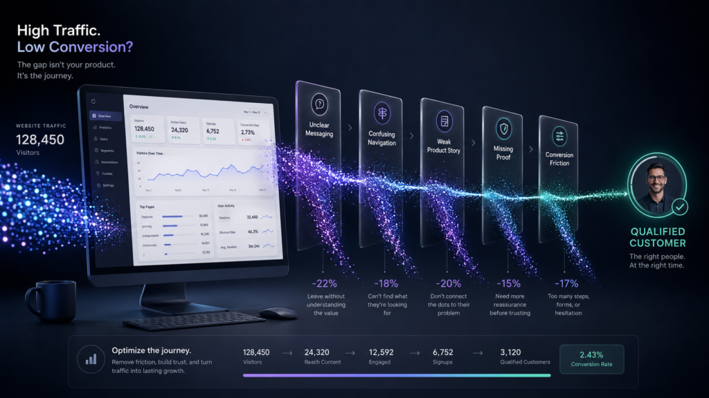
Illustration showing why SaaS websites fail to convert visitors into qualified customers and the customer journey
How to Begin SaaS Website Conversion Optimization and Diagnose a SaaS Problem
SaaS website conversion optimization should begin with structured diagnosis rather than assumptions about what needs to change.
Before redesigning the website, conduct a structured diagnosis.
Step 1: Clarify the Business Objective
Determine which outcomes matter most:
- More qualified demos
- More trial starts
- Larger enterprise opportunities
- Better product understanding
- Shorter sales cycles
- Stronger category positioning
- Expansion into new industries
- Improved organic visibility
- Better sales enablement
A website cannot optimize equally for every objective.
Step 2: Identify Priority Audiences
Define:
- Economic buyers
- Product users
- Technical evaluators
- Internal champions
- Procurement stakeholders
- Security and compliance reviewers
Document what each audience needs to understand and believe.
Step 3: Review the Current Journey
Evaluate:
- Landing-page relevance
- Message clarity
- Navigation
- Product understanding
- Calls to action
- Trust signals
- Forms
- Mobile experience
- Performance
- Accessibility
- Content depth
Step 4: Combine Quantitative and Qualitative Evidence
Use:
- Analytics
- Search Console
- CRM data
- Heatmaps
- Session recordings
- Form analytics
- Customer interviews
- Sales interviews
- Support insights
- Usability testing
- Competitive analysis
Analytics can show where visitors leave.
Research helps explain why.
Step 5: Prioritize by Impact
Classify findings based on:
- Business impact
- User impact
- Confidence in the evidence
- Implementation effort
- Dependencies
- Strategic relevance
Do not allow the easiest changes to displace the most important changes.
SaaS Website Conversion Optimization Checklist
Use this abbreviated checklist to evaluate your current website.
Positioning and Messaging
- Can a new visitor explain the product after viewing the homepage?
- Is the target audience clear?
- Are outcomes connected to capabilities?
- Is terminology consistent?
- Does the messaging differentiate the product?
Information Architecture
- Does navigation reflect buyer needs?
- Are product, solution, industry, and resource pages clearly distinguished?
- Can each key audience find relevant information?
- Are related pages connected through internal links?
- Is important decision content easy to access?
Product Storytelling
- Does the website show how the product works?
- Are screenshots readable and explained?
- Are workflows demonstrated in context?
- Does product evidence support marketing claims?
- Can visitors understand the product without a sales call?
Trust
- Are customer outcomes specific?
- Are security and compliance details available?
- Is implementation explained?
- Does the website establish company credibility?
- Are proof points placed near relevant claims?
Conversion
- Does each page have a logical next step?
- Are primary and secondary actions available?
- Do forms request only necessary information?
- Is the post-submission experience clear?
- Can lower-intent visitors continue researching?
Technical Experience
- Does the site load quickly?
- Is it stable during loading?
- Are interactions responsive?
- Does the website work well on mobile?
- Does it meet established accessibility requirements?
Measurement
- Are qualified leads tracked through the CRM?
- Are key journeys measured?
- Are content-assisted conversions visible?
- Are performance benchmarks documented?
- Is there a post-launch optimization process?
The Core Principle: SaaS Website Conversion Is the Result of Alignment
A high-converting SaaS website is not created by adding more persuasion to a weak experience.
It is created by aligning:
- The business strategy
- The product
- The audience
- The positioning
- The content
- The information architecture
- The user experience
- The visual system
- The technology
- The conversion path
- The measurement framework
When those elements support one another, the website becomes easier to understand, easier to trust, and easier to act on.
That is the real purpose of SaaS website conversion optimization. It is not about pressuring more visitors into a funnel. It is about creating the clarity and confidence qualified buyers need to move forward.
It is not about pressuring more visitors into a funnel.
It is about creating the clarity and confidence required for qualified buyers to move forward.
Planning a SaaS Website Redesign?
A SaaS website redesign should do more than update how the company looks.
It should sharpen the company’s positioning, clarify the product, support complex buying journeys, strengthen search visibility, improve conversion paths, and create a scalable foundation for continued growth.
Black Flag Creative partners with growing SaaS companies to plan, design, and develop custom websites built around business strategy, user experience, product storytelling, technical performance, SEO, AEO, and measurable outcomes.
Contact Black Flag Creative to schedule a discovery session and explore what your next SaaS website needs to accomplish.
Frequently Asked Questions Why Your SaaS Website Isn’t Converting Visitors Into Customers FAQs
Traffic may not convert when the website attracts the wrong audience, fails to clearly explain the product, lacks relevant evidence, or presents a conversion action that does not match visitor intent. SaaS website conversion optimization can help identify whether the underlying issue is traffic quality, unclear messaging, weak product storytelling, missing trust signals, confusing information architecture, or a conversion path that does not match buyer intent. Review traffic quality, messaging, information architecture, product storytelling, trust signals, and conversion paths together.
There is no universally useful SaaS website conversion benchmark. Performance varies by traffic source, product category, price, sales model, audience, conversion type, and level of buyer intent. Establish benchmarks by segment and measure qualified pipeline, not only total form submissions.
A SaaS homepage should clearly communicate the product, audience, problem, value proposition, primary capabilities, supporting evidence, differentiation, and next steps. Additionally, it should also direct visitors toward deeper content based on their needs and buying stage.
Improve demo requests by clarifying product value, attracting qualified traffic, reducing uncertainty, showing the product in context, strengthening customer evidence, aligning calls to action with buyer intent, and simplifying the scheduling or submission process.
A redesign may be necessary when the website no longer reflects the product or market position, conversion has stalled, navigation has become confusing, content cannot scale, visual credibility has declined, organic visibility is limited, or marketing teams cannot support growth efficiently.
The timeline depends on website size, product complexity, stakeholder availability, content requirements, integrations, research, and technical scope. A strategic redesign usually requires distinct phases for discovery, messaging, information architecture, UX, visual design, development, content, testing, and launch.
SaaS website design refers to the experience used to market and explain the product. SaaS UX may also include the usability of the software itself. The two should feel related, but they serve different user needs and stages of the customer journey.
SEO can improve conversions when it attracts visitors whose search intent aligns with the product and sends them to relevant, useful pages. Rankings and traffic alone do not guarantee leads. Search strategy must connect audience problems, content, product relevance, and conversion paths.
SaaS companies should publish original, useful content with clear answers, consistent terminology, logical page relationships, credible authorship, crawlable text, internal links, and relevant structured data. AI search optimization should strengthen foundational SEO rather than rely on unsupported shortcuts.
No. The conversion model should reflect product complexity, pricing, implementation requirements, customer maturity, and sales strategy. Keep in mind, some products benefit from self-service trials, while others require a guided demo, consultation, proof of concept, or technical evaluation.